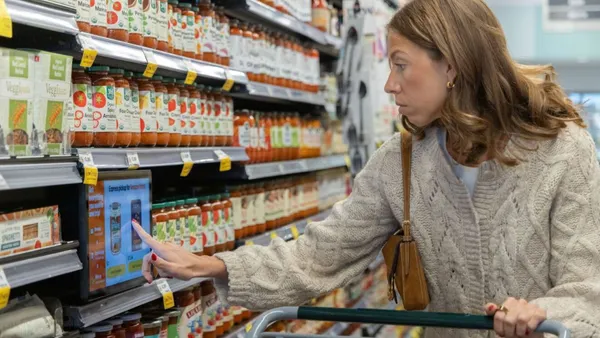
Small and regional grocery chains can't expect to beat large omnichannel competitors at their own game.
With a combined Kroger-Albertsons looking to join massive retailer competitors like Walmart and Amazon, grocers will need to embrace “niching” to gain an edge on their rivals, said Kevin Kelley, co-founder and principal of store design firm Shook Kelley.
“I think middle-of-the-road grocery stores are in the same [position] the department stores are in, and that is department stores were great for many generations and then we just changed how we live. And now we want extreme-position [retailers],” Kelley said.
Grocers that struggle to differentiate themselves often lean into price and convenience, but when grocers try to cater to a wide variety of shopper needs as a department store would, it can leave consumers questioning what, exactly, makes that retailer special.
“They're running a race they're not going to win. That game is skewed towards big, so Walmart wins. Amazon wins. Kroger wins,” he said.
He continued: “The hardest thing for old grocery stores to understand is that we no longer want a middle-of-the-road, lukewarm position.”
In a world increasingly filled with brands and businesses that focus on refining specific items, like Casper mattresses and Away luggage, grocers can take a similar approach, Kelley said.
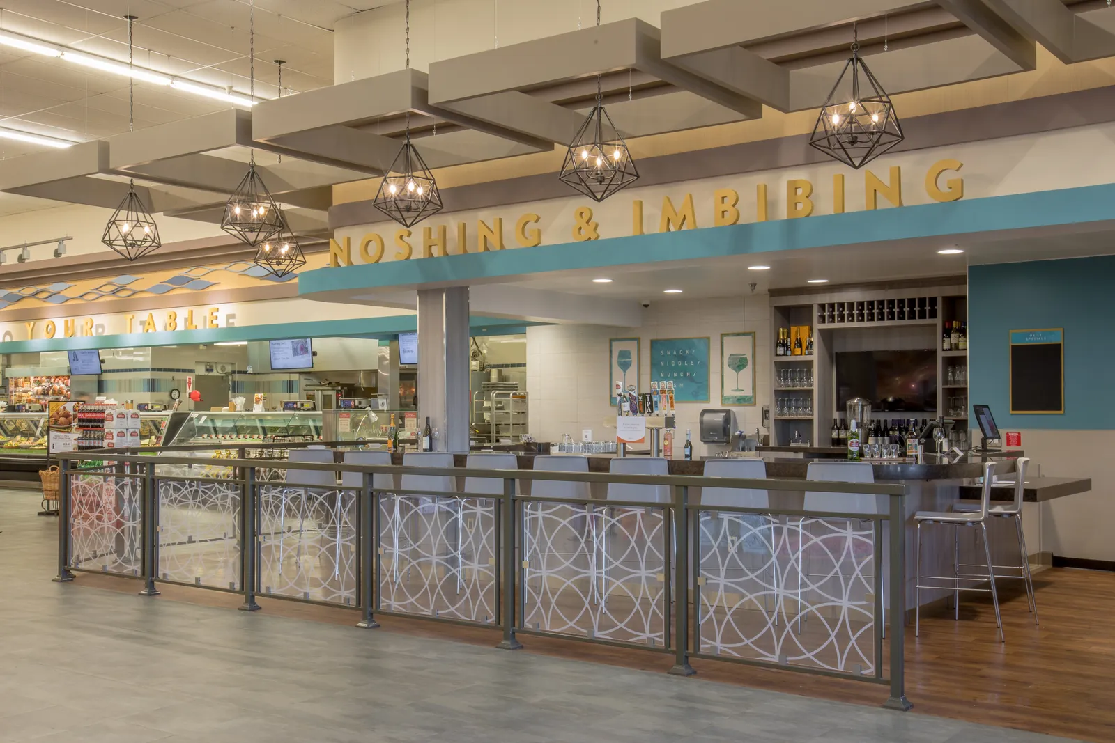
An advocate for smaller stores with more curated selections, Kelley is already working with regional grocers to help them differentiate and win over shoppers with experiential shopping, unique assortments and in-store eating.
As grocers seek out ways to make their assortments and store designs unique, Kelley highlighted ways small and regional chains can factor in shopper psychology and the theater of retail.
Shifting out of old-school mindsets
Grocers of all stripes focus on low prices to attract consumers. Even as inflationary pressures and SNAP funding changes have squeezed shoppers’ wallets and placed more emphasis on low prices, Kelley is wary of a future where price is the “common dimension” that all grocers aim for.
Many grocers are terrified of change, Kelley said. But to find different storytelling and value-added opportunities in their stores, they need to question their long-held traditions.
“The future of food scares a lot of people but the past of food really makes people comfortable,” Kelley said, noting that Whole Foods Market early on built its brand around a persona of being a “Mother Earth who knows better than Monsanto.”
One area where Kelley wants to see grocers challenge their store design mindsets is around aisles. Grocery stores since the 1990s and 2000s have been making their aisles bigger and wider as their product assortments and store footprints have grown, Kelley said.
If grocers equate their aisles to roadways, bigger isn’t necessarily better for driving more sales, he said.
“If you have a wider road or boulevard, cars drive faster. On a narrow road, they drive slower,” he said. “We need to have freeways and side streets, but an aisle is meant to be a side street, and so when customers shop more, they see more. They experiment more and they tend to increase the basket size.”
Alcoves and rooms — the perception of a new shopping realm inside the store — can also slow customers down, Kelley said.
“When customers shop quick, they buy less,” he said.
Rethinking aisles
Grocers have long used their stores as not just places for customers to shop, but also as warehouses for products, Kelley said. While some retailers have leaned into the warehouse concept as part of their shopping experience — Costco uses its racks and layout to signal a utilitarian and inexpensive position — Kelley wants to see grocers move away from their reliance on aisles.
Aisle design and shelf heights have biological, physical, emotional, financial and logistical impacts on consumers, Kelley said.
“We as humans don't like tall, narrow, long space. We don't like corridors in the house. We want to be in a room. We don't like alleyways. We actually feel unsafe [in an] alleyway,” Kelley said.
In an industry that has relied on an aisle-by-aisle design for decades, the idea might seem like sacrilege. But Kelley is clear: He would like to see grocers get rid of aisles “when and where possible.”
“The aisle in general is not really a human space. It is a logistics space for the convenience of grocery stores and CPG companies who want to get in at six in the morning and unload their stuff and go home,” Kelley said.
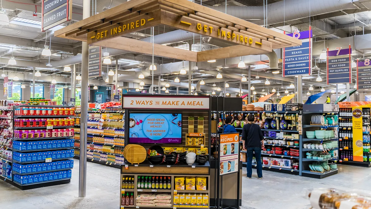
The alternative is to create “perceptual rooms” — designated spaces that don’t have walls but are set apart by changes in design elements like columns or different materials, he said. Changing a section of a store can encourage shoppers to move circularly and go over an area twice or more — a behavior they’re discouraged from doing in current store designs — with the goal of increasing basket size and sparking customer curiosity, he said.
“Context is what really sells. It’s analogous to plating a fantastic martini in a coffee cup — you would be very disappointed because you want the martini glass."

Kevin Kelley
Co-founder and principal, Shook Kelley
Likening grocery shopping to a movie, Kelley said retailers can create a “threshold experience” where consumers feel like they are entering new areas, like a scene change in a film.
“The old theory used to be that you couldn't get consumers to go into rooms if they didn't want to go into rooms [and] that would slow them down. But in our work, we totally changed that,” Kelley said.
Scaling back or eliminating aisles, though, poses a new dilemma: reduced SKU counts. While grocers have told Kelley that the amount of sales is more important than their number of SKUs, they run into the problem of having to reconsider the slotting fees they charge brands for shelf placement. That extra income has become particularly valuable as profit margins continue to get squeezed by e-commerce operations, complex supply chains and other costs.
Still, Kelley thinks that reducing SKUs is an opportunity for grocers to treat their assortments like a magazine instead of as a catalog. Why do consumers need 10 different types of pickles when they could have two? he asked.
Tailored department strategies
Across departments, presentation matters: “We're wired as humans to just make split-second decisions about what something is, where it comes from, what its values are,” Kelley added.
In seafood, ice can provide a strong visual cue around quality, he said. Similarly, in the produce department — the crown jewel for many grocers — grocers have often turned to barrels and crates to make the items look like they came fresh from the farm,” he said.
However, that “farm fresh” staging has been used so much that it’s become harder for grocers to impress customers, he said.
As grocers reevaluate their store designs, each category will have its specific issues. In seafood, for example, price tends to matter more because it’s hard for consumers to tell if the product is fresh or not, he said.
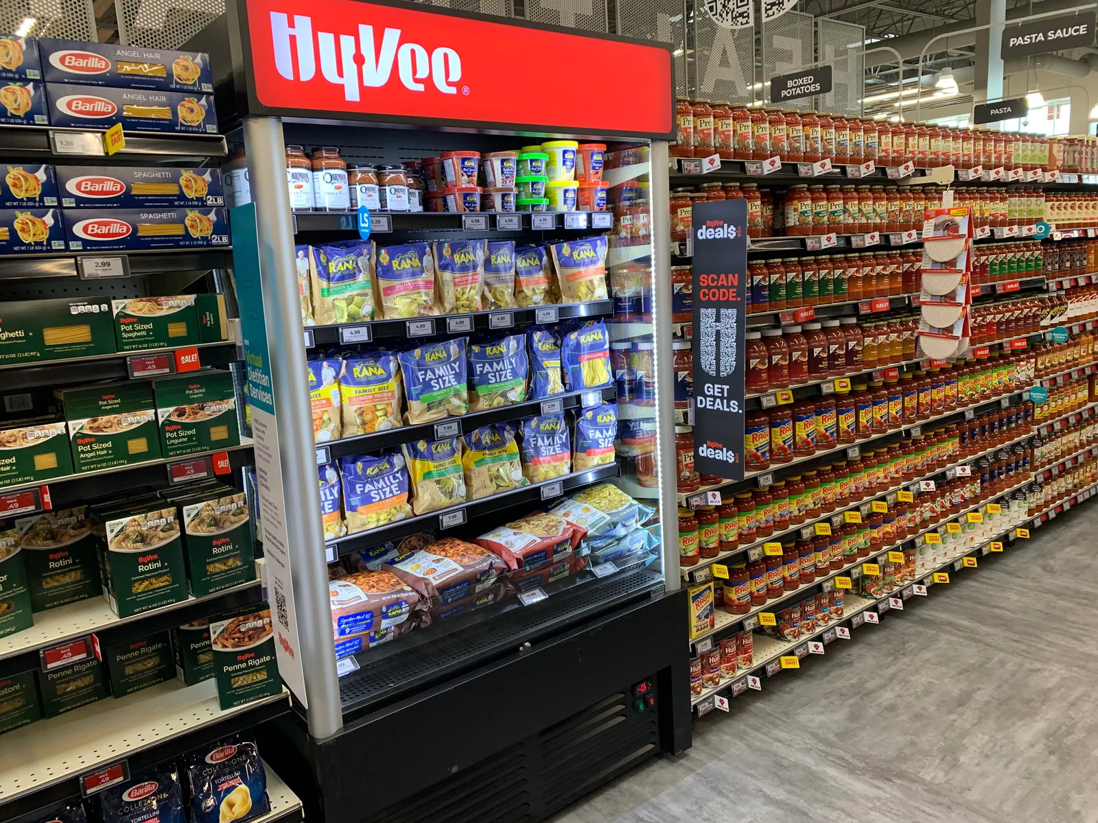
Meanwhile, grocers’ center stores are getting squeezed by Amazon and mass merchants, which sell the same Coca-Colas and macaroni boxes that shoppers can find in those aisles — often for less.
“It's a very vulnerable part of the store,” Kelley said. The beverage aisle, in particular, needs a revamp because the traditional aisle of 60 to 70 drink products [is] overwhelming consumers, he said.
Grocers can shift center store from “commodity rows to mindset zones” that aim to solve shopper conundrums like: “I'm trying to find ways to pack lunch for my kids for school. I'm trying to find one easy menu. I'm trying to learn how to make international meals,” he said. For example, a grocer could create a center store display focused just on what to pack in a kid’s lunch.
As grocers challenge their assumptions and traditions around store design and merchandising, Kelley wants them to keep shopper psychology top of mind.
“Context is what really sells. It’s analogous to plating a fantastic martini in a coffee cup — you would be very disappointed because you want the martini glass,” he said.


